CLIENT
Kind Inside
SERVICES
Branding Identity &
Website Design
About Kind Inside
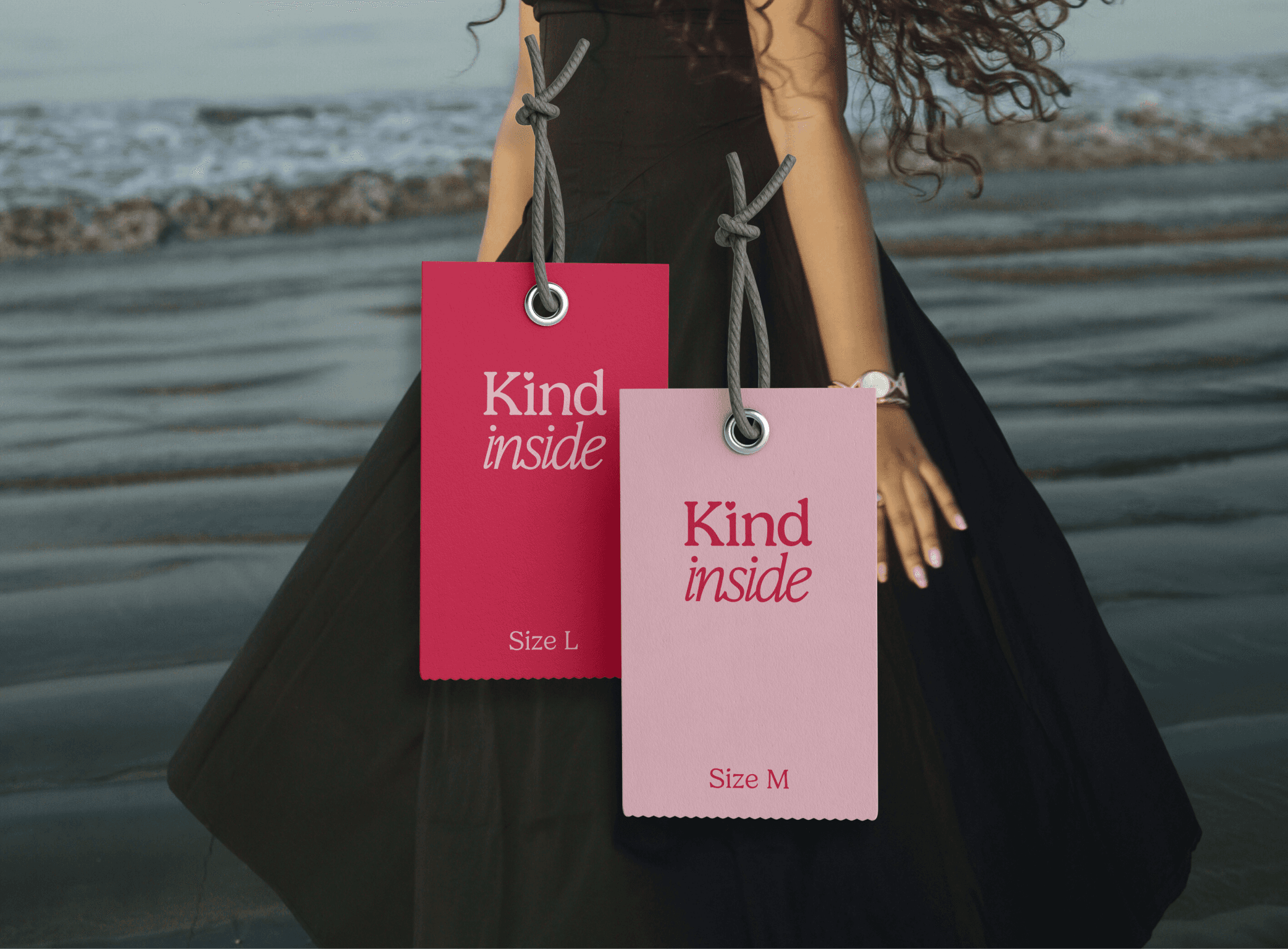
Kind Inside is a women-centric clothing brand built on the belief that kindness begins with how we treat ourselves — and what we wear plays a part in that. Designed to be both affordable and effortlessly stylish, the brand offers thoughtfully crafted pieces for women of all ages, sizes, and walks of life.
Rooted in a legacy of textiles, founder Vishva carries forward the values and craftsmanship passed down from her father’s work in the fabric industry. With Kind Inside, she has created a label that celebrates comfort, confidence, and everyday beauty for the modern woman.
Project Overview
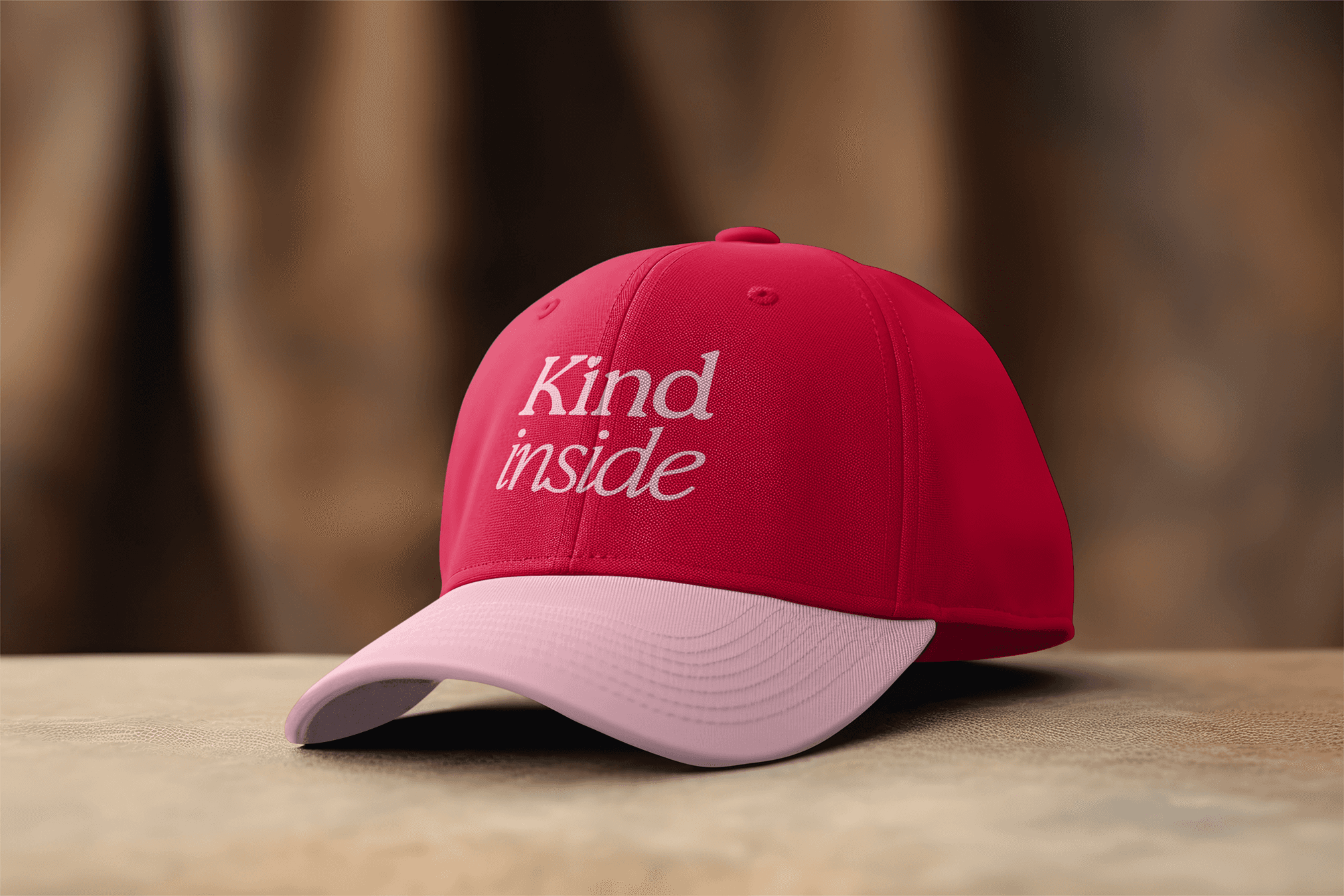
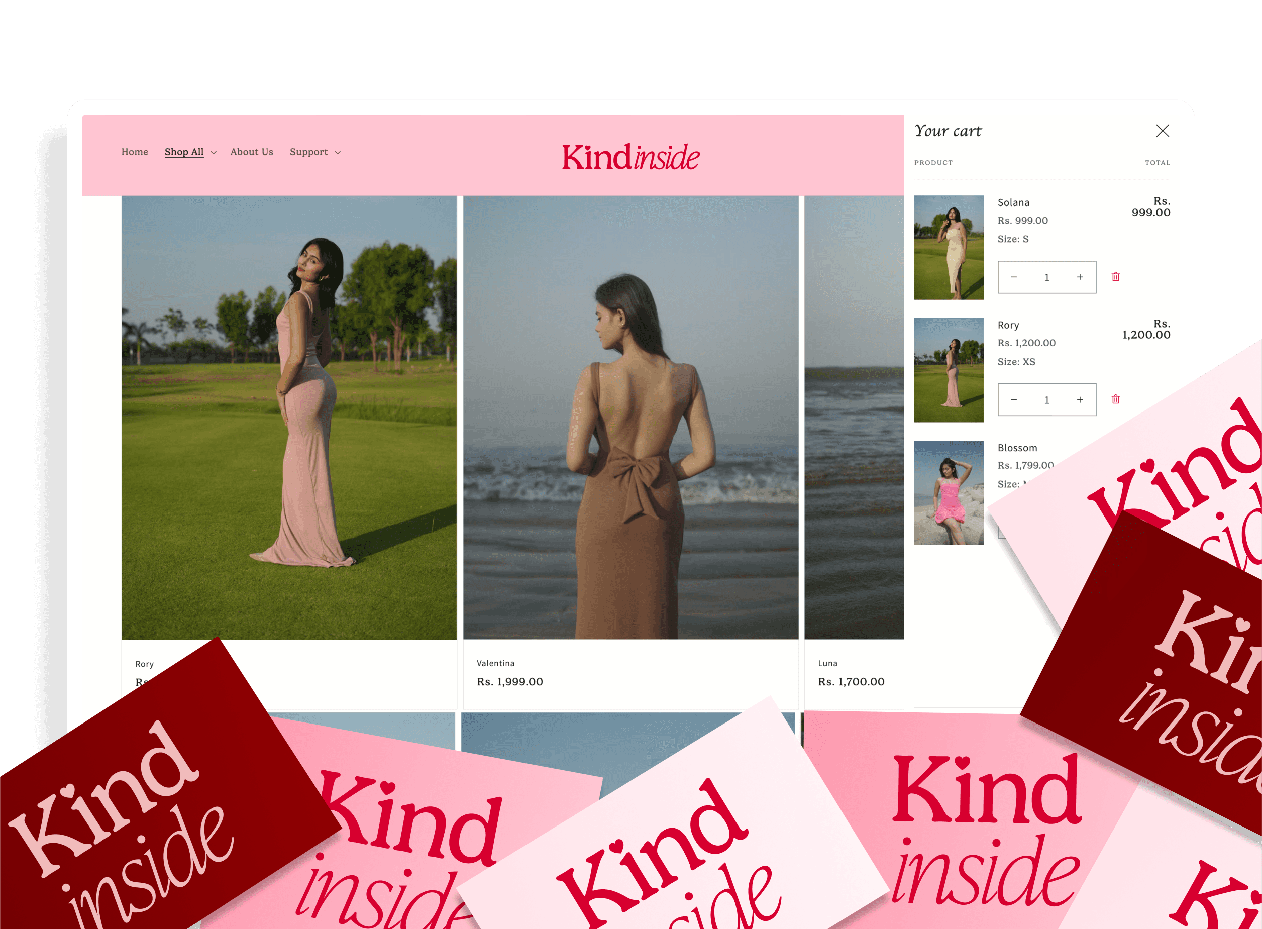
I worked on the branding and mobile-centric e-commerce website for Kind Inside, a women-focused clothing brand offering affordable, stylish pieces for all ages and sizes. Inspired by the brand's vision, the visual identity is rooted in kindness.
Built on Shopify, the website offers a seamless shopping experience across devices, with a design that prioritises ease and clarity on mobile while staying equally intuitive on web. Every detail was crafted to reflect the brand’s inclusive and feel-good spirit.

Logo Concept: Defining KIND INSIDE's Identity